Gallery
This page shows what curved-text
does, one figure per feature. Each figure comes from a self-contained script in
the repository’s
examples/
directory, and the link under each figure points to that script. To run the
scripts, see Running the scripts.
The case for the tool
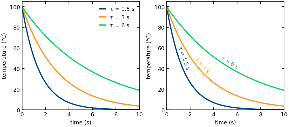
Direct labeling replaces the legend
Each curve carries its own label, so the reader needs no legend. In (a), a legend maps colors to curves, and the eye must move between the key and the data. In (b), each curve is labeled along its own curve.
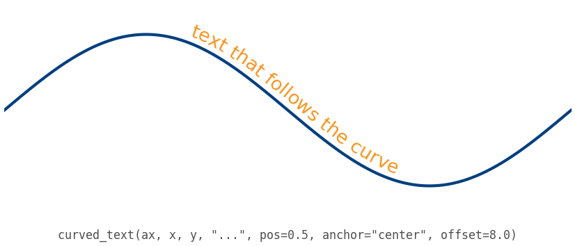
Hello, curve
One label follows one curve. It is centered, with a small perpendicular offset.
Mathtext follows the curve too
A $...$ run is laid out by matplotlib’s mathtext engine and bent along the
curve in the same way as plain text. Plain and math runs mix in one string. On
this gentle curve, the radical (square-root sign), the parentheses, and the
superscripts stay joined.
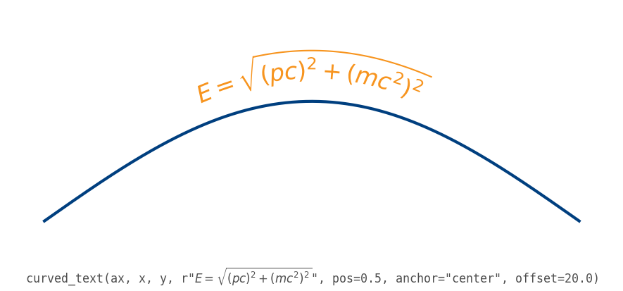
Fractions, radicals, and large brackets stay joined while the radius of curvature is larger than the height of the expression. On a tighter bend the expression is squeezed along the curve. Where the radius falls below its height on the concave side, it folds over itself: ink beyond the center of curvature comes out mirrored. Choose the text size to suit the curvature.
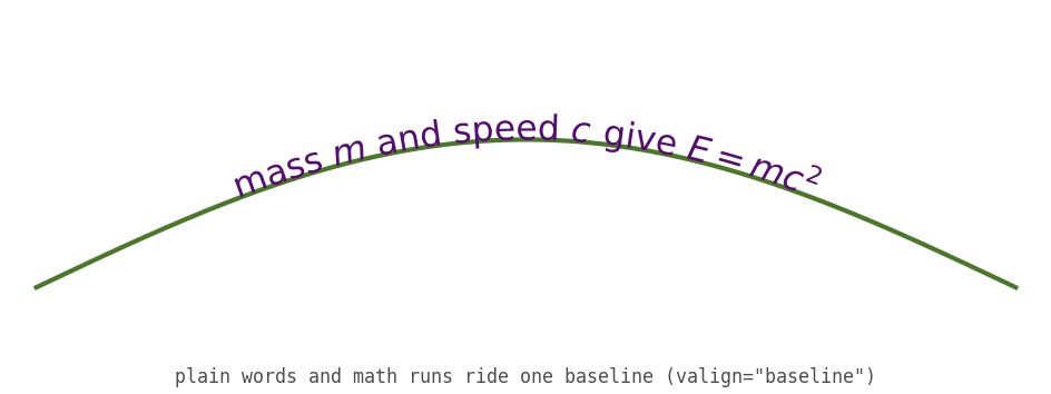
Plain words and math share one baseline
Plain words and math runs in one label share a single baseline. The math symbols sit level with the surrounding words, and a superscript lifts only the exponent, not the body.
LaTeX typesets the labels under usetex
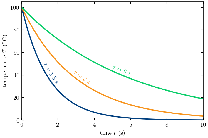
Under LaTeX typesetting (usetex), LaTeX sets the curved labels in the same
typeface as the tick labels and axis labels. To get this, set the
text.usetex rcParam (a matplotlib runtime setting) to true and use the serif
font family. The figure is the direct-labeling figure drawn this way. The
script needs latex (a typesetting system) and dvipng, which matplotlib uses
for the tick labels, as any matplotlib usetex figure does. It skips the figure
without them.
The placement controls
pos, anchor, offset, and valign are independent. Each multi-panel
figure in this section varies one of them and holds the others fixed.
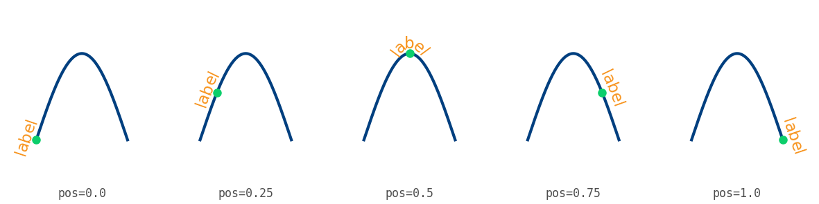
pos: where the label is anchored, as a fraction of arc length
The ring marks the anchor point. pos runs from the first point of the curve
(0.0) to the last point (1.0). The default is 0.5.
Every panel makes this call, with the argument its caption names:
curved_text(ax, x, y, "label", pos=pos, anchor="center", offset=7.0)
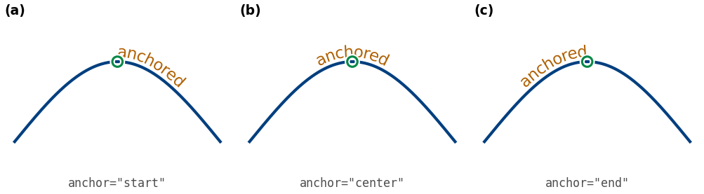
anchor: which part of the label lands at pos
The ring stays at pos=0.5 in every panel. The start, the middle, or the end
of the word sits on it. The default is "center".
Every panel makes this call, with the argument its caption names:
curved_text(ax, x, y, "anchored", pos=0.5, anchor=anchor, offset=7.0)
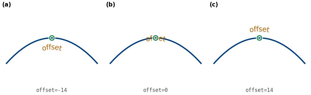
offset: a perpendicular shift off the curve
offset shifts the label at a right angle to the curve, in points (1/72
inch). A positive value moves the label to the left of the direction of
travel, which is above a curve that runs from left to right. The default is
0.0. The ring marks the anchor point on the curve and stays visible over the
label at offset=0.
Every panel makes this call, with the argument its caption names:
curved_text(ax, x, y, "offset", pos=0.5, anchor="center", offset=offset)
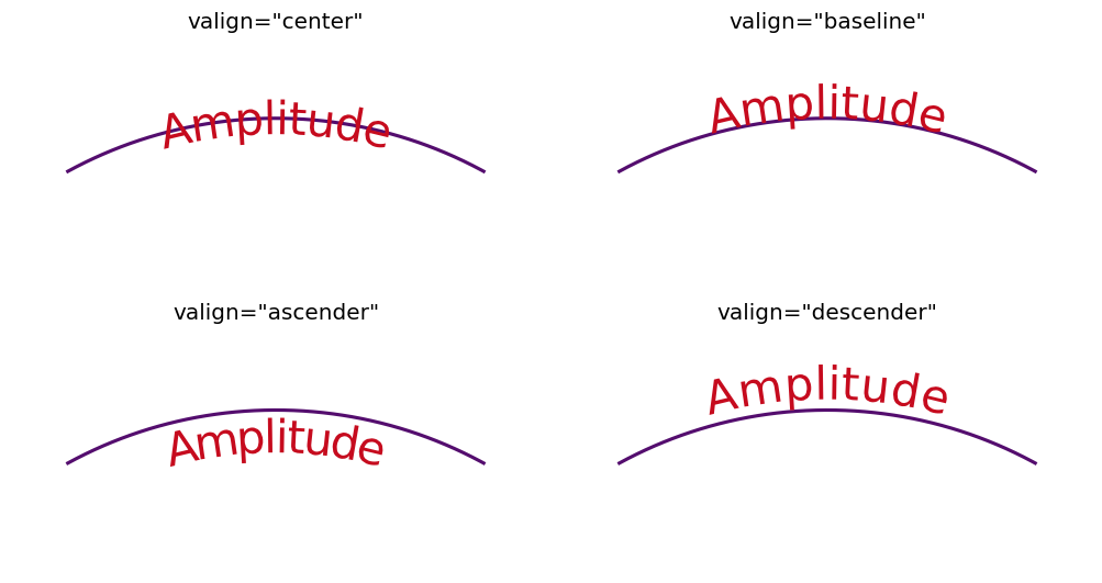
valign: which line of the text lies on the curve
By default the text straddles the curve (valign="center"). With "baseline",
the text baseline lies on the curve: the body sits above the curve and the
descenders below it. With "ascender" or "descender", the top or the bottom
of the text lies on the curve. The shift is one font metric applied to the
whole label, so it does not change the spacing or the alignment of plain text
with mathtext.
Every panel makes this call, with the argument its caption names:
curved_text(ax, x, y, "Amplitude", pos=0.5, anchor="center", valign=valign)
Common problems
Why a label reads upside down: direction of travel
A label reads in the order of the points of its curve as they appear on screen. The arrowhead at the end of each curve marks that direction. The figure shows one sine curve three ways:
(a) The points run from left to right, so the label is upright.
(b) The arrays are reversed, so the points run from right to left and the label is upside down.
(c) The x axis is inverted, so the points also run from right to left on screen, with the same result.
pos counts from the first point, and offset is measured to the left of the
direction of travel. Reversing the arrays therefore also moves the label along
the curve and to its other side. To make a label upright on a curve that runs
from right to left on screen, reverse the arrays. In each caption, ... stands
for the same arguments: pos=0.4, anchor="center", offset=7.0.
![Three panels of one sine curve, each with an arrowhead at the end of the curve and the label 'reads this way'. In (a), the call is the plain one, the points run left to right, and the label is upright. In (b), the call uses x[::-1], y[::-1], and the label is upside down. In (c), the call follows ax.invert_xaxis(), and the label is upside down.](https://raw.githubusercontent.com/thiebes/curved-text/main/examples/images/17_direction_of_travel.png)
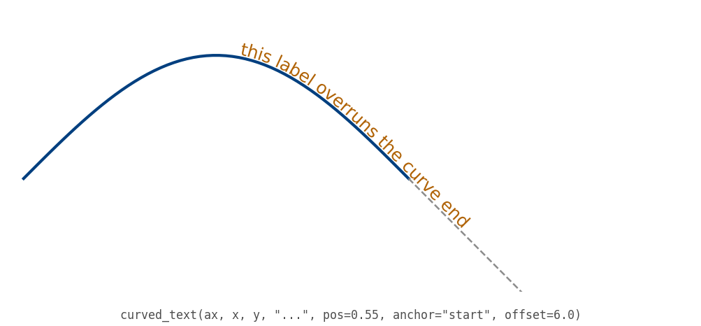
An overrun follows the end tangent
A label that is longer than its curve is not clipped. The curve is extended along its end tangent (dashed), and the glyphs that overrun the end lie on that straight line.
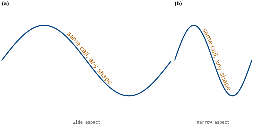
The label follows the curve when the aspect ratio changes
The same curve and the same call are drawn at two aspect ratios. The layout is recomputed on every draw, in display space, so the spacing and the offset stay correct. The label is not stretched or sheared. The next figure animates the interactive case, pan and zoom.
Both panels make this call:
curved_text(ax, x, y, "same call, any shape", pos=0.5, anchor="center", offset=8.0)
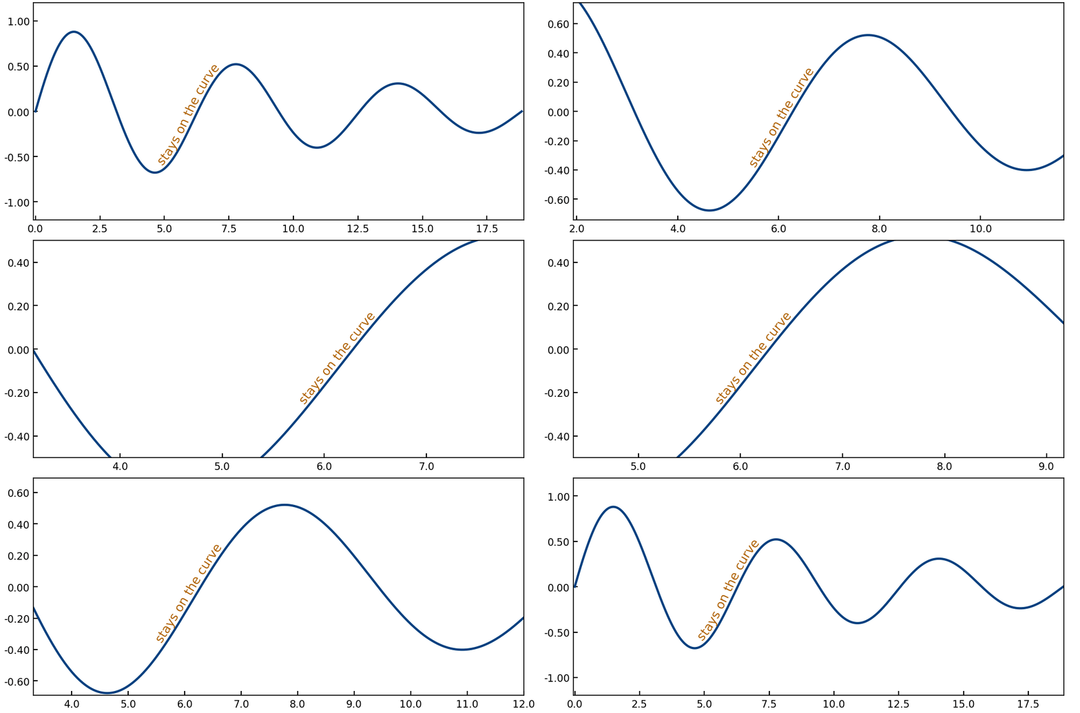
The label follows the curve through pan and zoom
One call draws the label. After that, only the axis limits change, on every frame, as interactive zooming and panning change them. The view zooms in toward the label, pans along the curve, and zooms back out to the start. The label stays on its curve through every change of scale and position. The axes box and the width of the tick labels are fixed, so nothing else on the figure moves. The label lies on the rising slope after the first trough. The script passes only that piece of the curve, so the label stays in view throughout:
curved_text(ax, x[stretch], y[stretch], "stays on the curve", pos=0.5,
            anchor="center", offset=7.0)
Even spacing on a tight bend
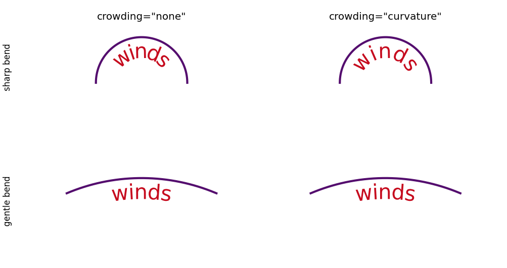
Characters are placed one after another by their own widths. On a sharp bend,
the glyphs come close together on the inside of the curve and can collide.
crowding="curvature" adds an even gap, a space added between every pair of
characters, that grows with the local curvature. The inside edges then stop
colliding. A deadband (a range below which no gap is added) applies: a gentle
bend stays below it. Panels (c) and (d), a gentle bend, are therefore
identical. Only the tight bend, panels (a) and (b), changes.
Every panel makes this call, with the argument its caption names:
curved_text(ax, x, y, "winds", pos=0.5, anchor="center", offset=-13.0,
            crowding=crowding)
Gaps in the curve
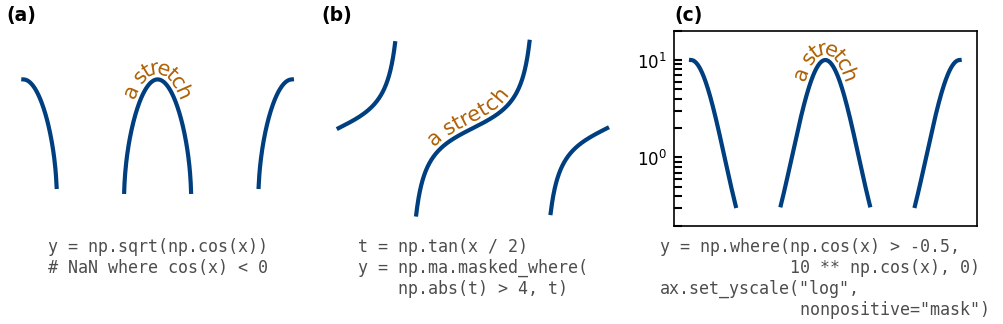
A curve has gaps where it has no value to draw. Panel (a) has NaN (not a
number) points. Panel (b) has masked points, which a NumPy masked array hides.
Panel (c) has zeros on a log axis, which cannot show them. A stretch is a
connected piece of the curve between gaps. The label follows only the stretch
that holds its anchor, and pos is measured along the drawn length. In (c),
the log axis masks the zeros (nonpositive="mask"), so the plotted line
breaks where the stretch does. The label treats the zeros as gaps whatever
that setting is. To run a label across gaps, pass a smooth curve that follows
the data instead.
Every panel makes this call, on the curve its caption builds:
curved_text(ax, x, y, "a stretch", pos=0.5, anchor="center", offset=6.0)
Styling and integration
Keyword arguments reach every character
Extra keyword arguments are Text properties applied to every glyph and every
math run, such as color, alpha, fontsize, fontfamily, fontweight, and
path_effects. Properties that describe one text box have no effect, because
the curve places every glyph: ha, va, rotation_mode, wrap, bbox,
linespacing, multialignment, and backgroundcolor. transform is
replaced, because glyphs are drawn in display pixels. Do not pass rotation:
it changes the spacing of the characters. Use box for a background. An
unknown property raises AttributeError. antialiased, snap, and
sketch_params are accepted and have no effect. label= adds no legend entry,
and legend() warns once for each part of the label.
In the next figure, one call sets color, size, weight, and font family, and every character takes them.

Clear the lines behind the label
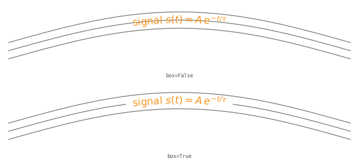
box=True draws a casing: a band that follows the curve at the label’s height,
under the glyphs. The label stays legible where it crosses other lines. The
casing is a single fill, so it covers plain text and mathtext alike. A lighter
alternative is a halo: a thin white withStroke that closely follows each
glyph, passed through path_effects.
Every panel makes this call, with the argument its caption names:
curved_text(ax, x, y, r"signal $s(t) = A\,e^{-t/\tau}$", pos=0.5,
            anchor="center", offset=0.0, box=box)
Box versus a path-effects stroke
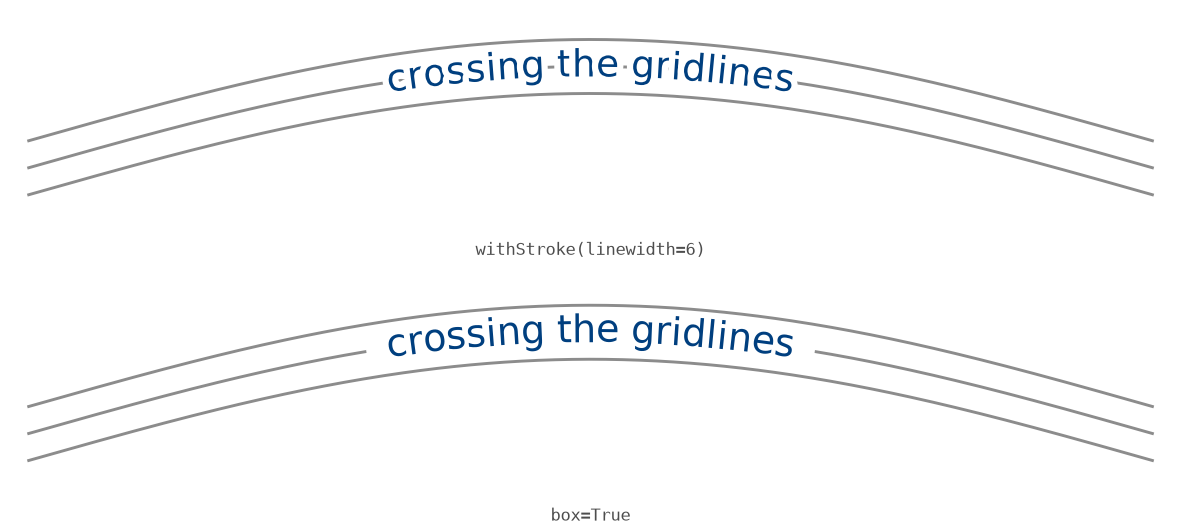
A wide stroke fails where a casing succeeds. The same plain-text label is drawn
over the same lines two ways. A wide withStroke is applied to each glyph
separately, so the strokes of neighboring glyphs overlap and the lines show
through small gaps. box is a single fill under the whole label, so it covers
plain text cleanly. For solid coverage under plain text, use box.
Every panel makes this call, with the keyword arguments its caption names:
curved_text(ax, x, y, "crossing the gridlines", pos=0.5, anchor="center",
            offset=0.0, ...)
A halo or a box
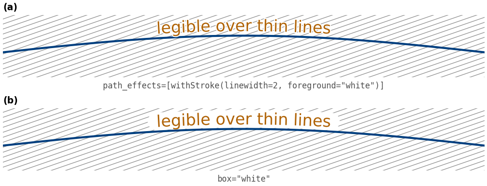
A thin halo and a casing clear thin lines in different ways. The same label is drawn over a family of thin lines that cross it. In (a), the halo hides the lines only where they touch the glyphs, so the lines stay readable between and around the glyphs. In (b), the casing, here in its color-string form (white, to match the page), is one band under the whole label. It clears heavy lines completely but erases every line inside the band. Use the halo for thin lines and dense figures, and the casing where the lines behind the label are heavy. A wide stroke blurs the glyphs together, as the section Box versus a path-effects stroke shows.
Every panel makes this call, with the keyword arguments its caption names:
curved_text(ax, x, y, "legible over thin lines", pos=0.5, anchor="center",
            offset=10.0, ...)
Several labels on one curve
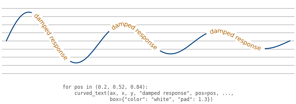
One call per label, each at its own pos, repeats a curve’s name along the
curve, as inline contour labels do. Each label clears the thin reference lines
behind it with a casing in its dict form. color sets the color of the band
(white, to match the page), and pad sets its height relative to the tallest
glyph. The reference lines show where the band cuts them.
Any matplotlib-backed axes (seaborn, pandas)
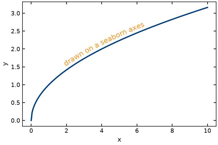
curved_text needs only a matplotlib.axes.Axes, so it works with seaborn,
pandas.DataFrame.plot, and any other library that draws on matplotlib. In
this figure, pandas reads the Stocks.csv sample data that is included with
matplotlib, and sns.lineplot draws two stock market indexes in seaborn’s
whitegrid theme. Each line carries a label along the line, in place of seaborn’s
legend. The script renders its figure only if seaborn and pandas are
installed. Both come with the examples extra, and neither is a runtime
dependency of curved-text.
Applications
Blackbody spectra
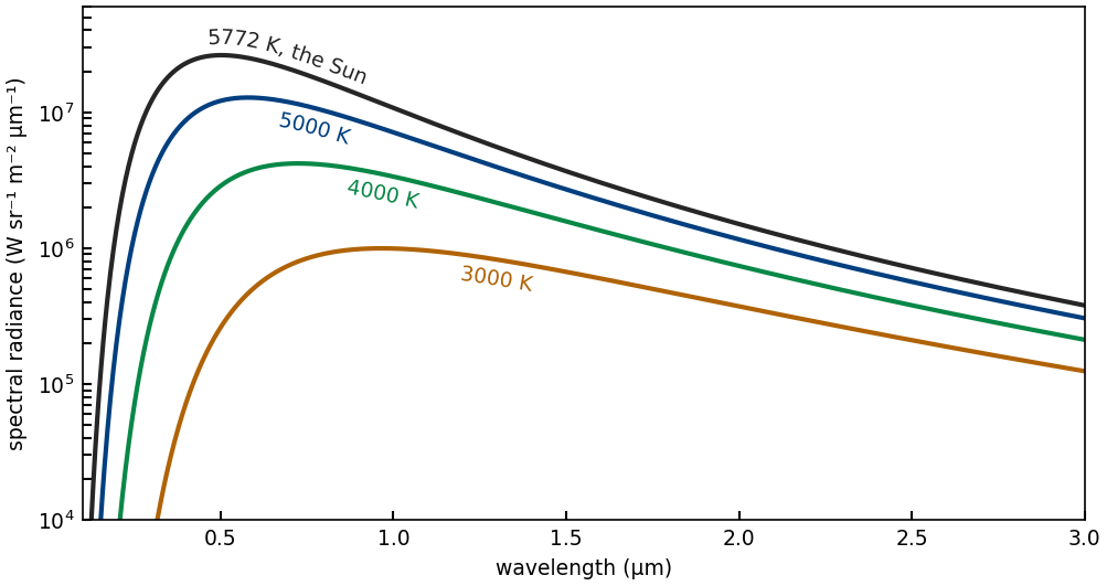
Planck’s law gives the spectral radiance of a blackbody. The figure shows four
temperatures, from a cool star to the Sun’s effective temperature, 5772 K, on a
logarithmic radiance axis. Each label follows its own curve, just past the peak.
Wien’s law puts the peak at the wavelength 2898 μm K / T. The script passes
curved_text only that piece of each curve. On this axis, most of a curve’s
length is its steep rising part at short wavelengths, which lies far below the
axes. A pos along the whole curve would count length that the reader never
sees.
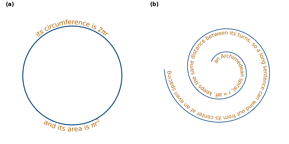
Text around a circle and along a spiral
(a) Each half of the circle is traced from the left side to the right side: the top half clockwise and the bottom half counterclockwise. Both labels therefore run from left to right on screen and read upright, outside the circle. (b) A sentence winds outward along the inside of an Archimedean spiral, r = aθ. Here r is the distance from the center, θ is the angle, and a is a constant. The turns keep an even spacing. Along the bottom of each turn, the text runs from right to left on screen and reads upside down, as the direction-of-travel section explains.
Stock prices on real dates
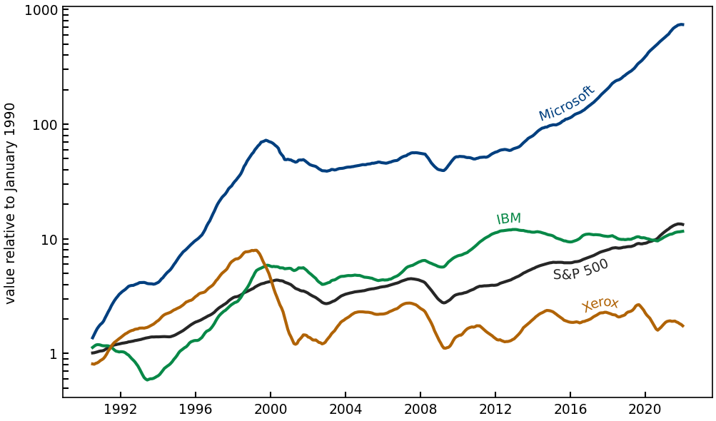
The figure plots monthly values from the Stocks.csv sample data on a log
axis. It shows adjusted closing prices for three stocks, which include
reinvested dividends, and the Standard & Poor’s 500 (S&P 500) price index,
which does not include dividends. Each series is relative to January 1990 and
smoothed with a 12-month rolling mean. The dates go to plot and
curved_text as datetime64 values. Even after smoothing, a monthly line has
small bends at the scale of one character, which would tilt neighboring glyphs
toward each other. Each label therefore follows a smoothed copy of its line,
filtered once more by a Gaussian filter about one character wide. The copy
follows the line without the small bends and is never drawn. The seaborn
figure labels its lines the same way.
Running the scripts
Running the scripts needs a clone of the repository. Install the package with
the examples extra, then regenerate every figure into
images/:
pip install -e ".[examples]"
python examples/generate_all.py
To run one script on its own:
python examples/example_02_sine_hello.py
Most scripts need only matplotlib and numpy, which the package installs. Three scripts have further requirements:
The seaborn figure (09) needs seaborn and pandas, which the
examplesextra installs.The usetex figure (16) needs LaTeX with
dvipng, which pip does not install. Without them the script skips its figure.The seaborn figure (09) and the stock price figure (23) read the
Stocks.csvsample data. matplotlib 3.5 does not include it, and both scripts skip their figures there.
House style
The scripts share these conventions:
The palette comes from the author’s Diffusion Insight Computation Engine (DICE) project. Its shades meet the Web Content Accessibility Guidelines (WCAG) 4.5:1 contrast minimum for text.
Each data series draws its line and its label in the same shade. Every label is placed along its own line, so the figures do not depend on color.
The background is white, sizes are in centimeters, and the resolution is an explicit number of dots per inch (dpi).
Most panels hide their axes on purpose. The subject is the geometry of text on a curve, and numeric ticks would distract from it.
The figures that plot data keep their axes and units: direct labeling, its usetex version, the seaborn figure, and the applications. So do the log-axis panel of the gaps figure, whose subject is the scale, and the pan-and-zoom animation, whose moving ticks show the view changing.
The caption under a panel gives the call that drew it. Where every panel of a figure makes the same call, its section gives that call once, and each caption shows only what differs. The applications have no captions; their paragraphs explain them.